Turning user feedback into actionable UX insights with AI

Research

UX/UI Design

Artificial Intelligence

Agentic AI

I designed an AI powered workflow to turn raw CSAT and CES feedback into actionable UX insights. What started as a manual analysis for one squad became a reusable system adopted by multiple squads, cutting end to end analysis time by 95%.

Overview

About the product

The project was developed for an internal API testing platform used by developers, frontend and backend engineers, QA professionals, and testers at a large Brazilian bank.

The platform works in a similar space to tools such as Postman or Insomnia, allowing technical teams to test APIs, generate mock data, analyze requests, and support different stages of the software development workflow.

As the platform evolved and expanded to multiple products, customer satisfaction research became an important source of insight for identifying usability issues and opportunities for improvement.

My role

I worked across Product Design, UX Research, AI prompting and workflow design, and frontend development.

My responsibilities included:

• Analyzing CSAT and CES research
• Defining the framework for interpreting qualitative and quantitative feedback
• Designing the AI assisted research workflow
• Identifying UX and usability opportunities
• Structuring the information architecture of the dashboard
• Prototyping and generating the interface with Figma Make
• Refining the generated frontend and CSS manually
• Defining the data and JSON structure consumed by the dashboard
• Creating a reusable AI skill for future research cycles

About the user persona

The primary users of the platform were technical professionals involved in software development:

• Frontend developers
• Backend developers
• Full stack developers
• QA professionals
• Software testers

For the feedback analysis system, the main users were the product and technology teams responsible for understanding customer satisfaction and presenting research findings.

Their main needs were to quickly understand:

• How users perceived the product
• What was working well
• What was causing friction
• Which problems were recurring
• What could be improved
• Which opportunities should receive further investigation

Discovery

The problem

The team already collected valuable customer feedback through CSAT and CES surveys, the problem was what happened after the data was collected.

The research arrived as spreadsheets containing scores, comments, complaints, compliments, and suggestions. Turning this raw data into useful product insights required a long manual process:

Analyze → Compare → Categorize → Find patterns → Identify UX issues → Suggest improvements → Validate → Build presentation

This process became increasingly inefficient as the number of research cycles and products grew. The challenge was therefore not simply to analyze customer feedback faster. It was to create a repeatable way of transforming customer feedback into actionable product intelligence.

The research

The research combined quantitative and qualitative data from CSAT and CES surveys.

Quantitative signals

I analyzed satisfaction and effort scores to understand the overall perception of the product and identify areas that required further investigation.

Qualitative signals

I analyzed customer comments to identify:

• Compliments

• Complaints

• Recurring pain points

• Usability issues

• User expectations

• Suggestions

• Product improvement opportunities

Rather than treating individual comments as isolated pieces of feedback, I looked for recurring patterns that could indicate broader UX problems.

The goal was to move from:

The research combined quantitative and qualitative data from CSAT and CES surveys.

Quantitative signals

I analyzed satisfaction and effort scores to understand the overall perception of the product and identify areas that required further investigation.

Qualitative signals

I analyzed customer comments to identify:

• Compliments

• Complaints

• Recurring pain points

• Usability issues

• User expectations

• Suggestions

• Product improvement opportunities

Rather than treating individual comments as isolated pieces of feedback, I looked for recurring patterns that could indicate broader UX problems.

The goal was to move from:

“What did users say?”

to

“What patterns can we identify, and what should the product team do about them?”

Delivery

Designing the AI assisted workflow

Instead of using AI only as a summarization tool, I designed a workflow where AI supported the entire transition from raw research to structured product insights.

The process became:

Raw survey data → AI analysis → Patterns & pain points → UX opportunities →

Structured research output → Interactive dashboard

Raw survey data → AI analysis →

Patterns & pain points →

UX opportunities →

Structured research output →

Interactive dashboard

Raw survey data → AI analysis → Patterns & pain points → UX opportunities →

Structured research output → Interactive dashboard

This approach reduced the amount of repetitive analysis while maintaining a consistent structure across research cycles.


From analysis to structured data

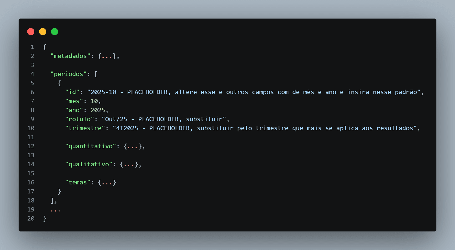
After the AI analysis, I generated a structured Markdown document containing the research findings. This created a consistent intermediate representation of the research before it reached the interface.

I then defined a standardized JSON structure containing the information required by the dashboard. This was an important step because it separated the research itself from the interface. The dashboard did not need to understand how the research was generated, it only needed to receive data in the expected structure.
Interface decisions

Turning research into an explorable experience

I used Figma Make to transform the structured research findings into an interactive dashboard.

Rather than presenting the research as a long report, I organized the information into multiple views that allowed users to quickly scan the overall results and then explore specific areas.


The dashboard brought together:

• CSAT and CES scores
• Positive and negative feedback
• Main complaints
• Recurring pain points
• UX and usability opportunities
• User suggestions
• Recommended improvements
• Supporting customer comments


The information architecture was designed around the questions stakeholders typically needed to answer:

"How satisfied are users?"

"What are they struggling with?"

"What are they praising?"

"What problems keep appearing?"

"What should we improve?"

This transformed the research from a static deliverable into an interface for exploring product intelligence.


From one dashboard to a reusable system

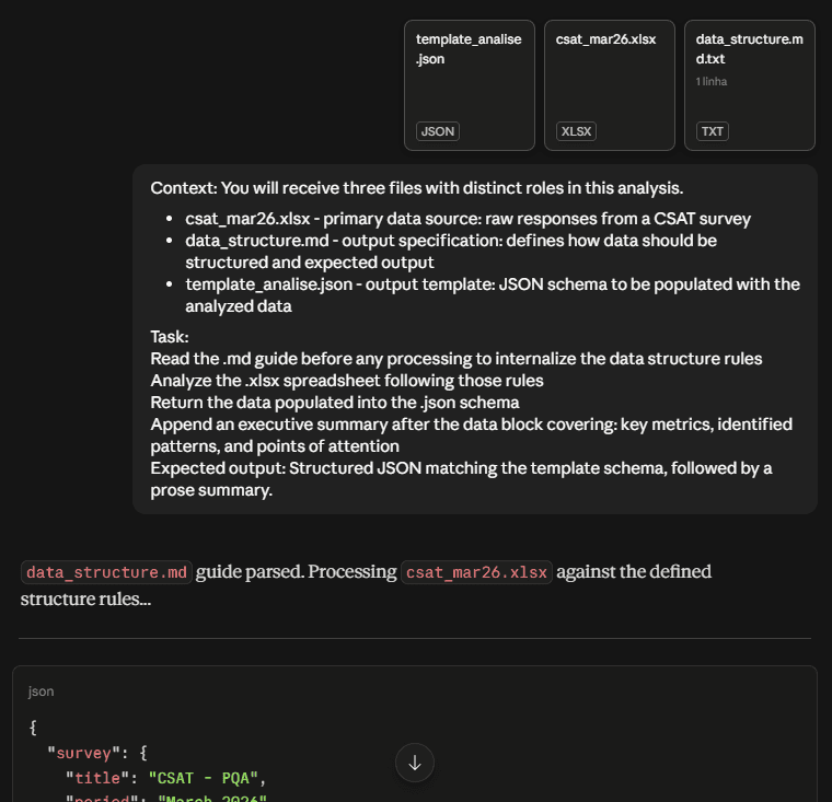
A key design decision was to avoid building a one off dashboard and rebuilding it later on. I wanted the interface to work as a reusable container for future research. To achieve this, I created a defined data structure that the dashboard could consume.

The workflow became:

New survey → AI analyzes the data → AI returns the predefined JSON structure →

Dashboard consumes the new data → Updated insights are available

New survey → AI analyzes the data → AI returns the predefined JSON structure →

Dashboard consumes the new data → Updated insights are available

This meant that future research could update the existing experience without requiring the dashboard to be redesigned or rebuilt, while maintaining the score history.

AI as part of the design workflow

Figma Make accelerated the creation and iteration of the dashboard, but it was not treated as a black box. When the available Figma Make credits were exhausted, I continued the implementation manually.

I made adjustments directly to:

• Frontend code

• CSS

• Data files

• JSON structures

• Interface behavior

• Content and information structure

The AI generated output was therefore treated as a starting point for iteration, rather than the final product.


AI as part of the design workflow

Figma Make accelerated the creation and iteration of the dashboard, but it was not treated as a black box. When the available Figma Make credits were exhausted, I continued the implementation manually.

I made adjustments directly to:

• Frontend code

• CSS

• Data files

• JSON structures

• Interface behavior

• Content and information structure

The AI generated output was therefore treated as a starting point for iteration, rather than the final product.

Limiting factors

Balancing AI speed with design control

Generative tools accelerated the initial implementation considerably, but they also introduced limitations in consistency, structure, and control over the generated output.

I had to manually review and refine the generated interface to ensure that the experience matched the intended information architecture.

Balancing AI speed with design control

Generative tools accelerated the initial implementation considerably, but they also introduced limitations in consistency, structure, and control over the generated output.

I had to manually review and refine the generated interface to ensure that the experience matched the intended information architecture.


Keeping the data structure stable

Because the dashboard depended on structured AI generated data, the format had to be predictable.

This led to the creation of a standardized JSON structure that acted as a contract between the AI analysis and the interface. This was critical for making the system reusable.


Keeping the data structure stable

Because the dashboard depended on structured AI generated data, the format had to be predictable.

This led to the creation of a standardized JSON structure that acted as a contract between the AI analysis and the interface. This was critical for making the system reusable.


Keeping the data structure stable

Because the dashboard depended on structured AI generated data, the format had to be predictable.

This led to the creation of a standardized JSON structure that acted as a contract between the AI analysis and the interface. This was critical for making the system reusable.


Moving beyond a one off solution

The initial challenge could have been solved with a single dashboard or report. However, doing so would have preserved the manual work for the next research cycle.

The larger design challenge was therefore creating a system that could continue generating value after the initial delivery.


Moving beyond a one off solution

The initial challenge could have been solved with a single dashboard or report. However, doing so would have preserved the manual work for the next research cycle.

The larger design challenge was therefore creating a system that could continue generating value after the initial delivery.


Moving beyond a one off solution

The initial challenge could have been solved with a single dashboard or report. However, doing so would have preserved the manual work for the next research cycle.

The larger design challenge was therefore creating a system that could continue generating value after the initial delivery.

Results

95% reduction in end to end analysis time

The workflow reduced the total time required to complete the research analysis by approximately 95%.

This reduction covered the complete process, including:

• Analyzing survey data

• Comparing and organizing information

• Identifying patterns

• Generating the dashboard

• Identifying UX and usability improvements

• Translating suggestions into product opportunities

• Performing general validation

The impact was therefore not limited to AI assisted analysis. It affected the entire research-to-presentation workflow.

95% reduction in end to end analysis time

The workflow reduced the total time required to complete the research analysis by approximately 95%.

This reduction covered the complete process, including:

• Analyzing survey data

• Comparing and organizing information

• Identifying patterns

• Generating the dashboard

• Identifying UX and usability improvements

• Translating suggestions into product opportunities

• Performing general validation

The impact was therefore not limited to AI assisted analysis. It affected the entire research-to-presentation workflow.


Adoption beyond the original squad

The solution was initially created for one squad, but after demonstrating its impact, the approach was requested and adopted by additional squads.

The system evolved from a solution for a single product into a reusable approach that could support multiple products and research cycles. The dashboard became part of the product satisfaction presentation workflow and is used by over 30 people, including developers, POs, PMs and Head of division.


Adoption beyond the original squad

The solution was initially created for one squad, but after demonstrating its impact, the approach was requested and adopted by additional squads.

The system evolved from a solution for a single product into a reusable approach that could support multiple products and research cycles. The dashboard became part of the product satisfaction presentation workflow and is used by over 30 people, including developers, POs, PMs and Head of division.


Adoption beyond the original squad

The solution was initially created for one squad, but after demonstrating its impact, the approach was requested and adopted by additional squads.

The system evolved from a solution for a single product into a reusable approach that could support multiple products and research cycles. The dashboard became part of the product satisfaction presentation workflow and is used by over 30 people, including developers, POs, PMs and Head of division.


Reusable by design

The most important result was not the dashboard itself, it was the whole system behind it. New research can be analyzed using the same AI workflow and returned in the predefined data format, allowing the existing dashboard to be continuously updated.

"One research cycle → one dashboard" became "One system → multiple products → multiple research cycles"


Reusable by design

The most important result was not the dashboard itself, it was the whole system behind it. New research can be analyzed using the same AI workflow and returned in the predefined data format, allowing the existing dashboard to be continuously updated.

"One research cycle → one dashboard" became "One system → multiple products → multiple research cycles"


Reusable by design

The most important result was not the dashboard itself, it was the whole system behind it. New research can be analyzed using the same AI workflow and returned in the predefined data format, allowing the existing dashboard to be continuously updated.

"One research cycle → one dashboard" became "One system → multiple products → multiple research cycles"

Conclusion

This project is one example on how I approach AI in Product Design.

The initial opportunity looked like a research analysis problem, but the deeper problem was a workflow problem.

Instead of simply asking AI to analyze customer feedback, I designed a system connecting:

Research + AI + Structured insights + AI-Generated Interface + Product decisions + UX Insights

The result was a 95% reduction in end to end analysis time, adoption beyond the original squad, and a reusable system that could continue supporting future research cycles.

For me, the key lesson was that the value of AI in Product Design is not only in generating outputs faster, but designing systems and workflows around those outputs so they can be reliable, reusable, and connected to real product decisions.

Matheus Gomes / 2025

Create a free website with Framer, the website builder loved by startups, designers and agencies.